
Frequently
Asked Questions
 |
GENERAL
Q. How do I get back to
the WeatherCam from here?
A. Either click the Colored banner at the top of the
page that says WeatherCam or hit the 'back' button in your browser.
Q. Does the WeatherCam
system run 24/7?
A. Yes, technically the
system runs continuously, however, the cameras are programmed to update for
approximately 12 hours commencing 0600hrs. This update cycle will change as
the days get longer so that in high summer, the viewing time will be extended
to approximately 15hours.
There is little point refreshing the website with the same black camera images at night. The Weather data section of the page will continue updating every 5 minutes, 24/7.
Q. There is a 'hit counter'
on the bottom. What's the difference between visits and hits?
A. A visit represents the first time someone views the
page for the day. A hit will also be recorded. If you come back later on in
the day, the WeatherCam system remembers you and does not record a new visit,
only a hit.
As of toady's date, we can therefore determine that of the 109,000 plus unique
visitors we've had since October 2008, they either return or refresh, on average,
just on twice per visit to the WeatherCam site.
CAMERAS
Q. When I log on I only
see still images. Is this correct or is my browser not setup properly?
A. Yes, this is correct and still shots are normal.
The image array is updated every minute and you should refresh regularly to
get the latest images.
Q. Will there be a full
motion live stream from the cameras?
A. No it will not be motion video. It should be said
that whilst the system is capable of outputting up to 6 frames per second,
this would have a very significant impact on both the network at MYC and at
YA, so the system has been setup to run only 1 frame per minute. Full motion
is also extremely hungry on your download usage!
Q. Do the images automatically
update for me?
A. No, the code behind the system could do this automatically,
but this process would have a detrimental effect on users with slower connection
speeds - these users would likely not see anything at all as their system
would spend the whole time trying to download images...which they would never
see as they keep changing before they finish downloading!
Q. When I refreshed earlier,
only two pictures came up and the third box had a 'broken link' icon in it.
Is there an intermittent camera system fault?
A. No it's not faulty. When your browser refresh occurred
the camera system was in the process of updating the WebServer with a new
set of images. Refresh your browser to fix this.
Q. Sometimes the brightness
and contrast varies between the cameras. Is this a fault with the camera?
A. No, this is not a fault - just an electronic function
of the cameras that cannot be overridden. The cameras each control their own
exposure and color balance, and sometimes one cameras frame may have a significant
difference to the others for reasons such as the morning sun, reflections
and even cloud cover in various parts of each shot will also affect the exposure.
The afternoons display the most consistent array as the sun is behind the
cameras.
WEATHER AND GRAPHS
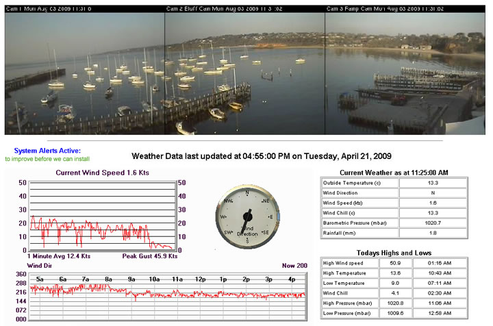
Q. I noticed this morning
that the wind direction indicated in the data did not seem to be the same
as where the boats were pointing in the harbor.
A. If you consider a windex or telltale on any boat
and you'll notice that it never sits still. Even if the wind is hard out of
the SW - it will continually bounce around, but in real time, your perception
is clearly that it is hard in the SW.
So to understand the apparent discrepancy with the boats direction and reported wind direction, it's important to note how the system actually assembles data for the site. The Weather Station takes a snapshot which lasts for less than half a second, and it is possible - more likely probable - that the wind direction vane was being buffeted around as they all do when the snapshot was taken.
Another point of interest here is that if the wind speed is read as zero by the system, the wind direction will not be updated. So if a light zephyr manages to turn the boats in the harbor without spinning the anemometer cups, the instrumentation will not reflect the direction shift until the anemometer is moving again.
This oscillations,
which are perfectly normal, appear averaged out using the Wind Dir chart and
although the oscillations are present, it becomes very easy to recognise the
predominant direction.
Q. What is the 1 minute
average and graph all about?
A. There are several items of interest here. Firstly,
the graph is a very
high detail snapshot of the the last 5
minutes showing all the fluctuations in speed for the period. The right hand
side of the graph is the most current and the left hand side is 5 minutes
ago. The text at
the top of the graph shows the current wind speed at the time the data sample
was grabbed and the lower left corner
shows us the mean (or average) speed for a 1 minute duration during this period
while the trace line shows the exact data for the whole 5 minute period. It
also notes the peak gust for the 24 hour period in the lower right corner.
Q. The new graphs seem
to have scales that might be exceeded. What happens if it blows over 25 knots?
A. The graphs are auto scaling and the vertical axis
will dynamically change as needed. If a bullet comes through, the chart may
not shift the scale up until there is a bit more steady pressure at that speed
range. The auto scaling will occur on all graphs and in the case of the barometric
pressure will lower the scale as necessary too.
Q. There are spikes and
lines everywhere. Why does it draw from top to bottom like that?
A. The best way to answer this is to study a screen
grab.
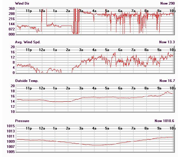
The above example shows some of the behavior you are talking about. Let's start at the left hand side of the graph. At 10pm we had a quite steady breeze from the East (our evening Sea Breeze) at about 6 knots and an outside temp of approx 15 degrees.
Just after 11pm, the breeze started to decrease and turn toward the North. The breeze fluffs up and down from zero to 4 knots for the next hour, then dies out completely at 12.00. The direction indicator then parks at the last reading until the breeze returns.
At approximately 12.20am, a light 5 knots fills in from ESE until 1.30am when it drops out completely again for nearly an hour. At 2.30am the breeze fills in and progressively builds from the North. The huge trace-line oscillations on the graph represent the breeze swinging through North to the NNW and back through North to the NNE. You must consider that that this line graph is displaying all bearings on the compass rose, and consequently North appears at the top and the bottom of the chart.Therefore as mentioned, as the breeze passes through North, it will re-appear either at the top or bottom of the graph depending on the direction shift.
At about 3am, it settles in direction in the NNW and continues to build.
The remainder of the graph shows the breeze is flukey and gusty. If we were to determine a trend for this period, it would be that when the breeze softens it clocks left, then as the speed increases, it clocks right to the NNW again. Between 7am and 9am is a good indication of this trend.
Notice
at about 2.10am the wind dies out and turns toward the North and the temperature,
not surprisingly, increases. The barometer is dropping through this period.Q.
The direction graph is full of red - what's that all about?
A. I assume you've seen something like this an wondered if there may be something wrong..
No there is nothing wrong with this at all - although it might appear a bit odd at first glance. You need to consider that a compass rose is 360 degrees - and a circlular representation, where 0 and 360 are the same thing.
When you create an X/Y graph like this one, then there must be a top and a bottom to it - in this case 0 and 360....but these are the same point on the compass!
So in the context of this picture, it is telling us that the wind is hard out of the North (0 or 360 degrees) and is crossing through this point continuously to become NNW or NNE. In this image, just after 4am the breeze sat in the NNW for nearly an hour.
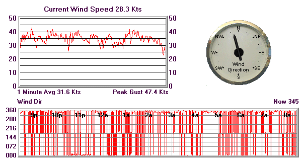
Q. On the graph explaining
the red trace line going top to bottom all the time can you please explain
why the small chart above it shows that it is blowing easy 35-40, but the
current wind speed is only 28.3 knots?
A. This graph is a 5 minute view and the current wind
speed reading is an instantaneous snapshot at the time of the system data
gather process. Therefore, in this case, there was clearly a brief lull or
some buffeting etc that slowed the speed down when the snapshot was taken.
So I suggest that in this instance it is more appropriate to read the 1 minute average value - which takes all of the pressure you are talking about - gusts and lulls and all and produces an average for the last 1 minute. This produces a reading more consistent with the 'overall picture' than the snapshot does.
 |
|
|
Stephen
Bolton & Associates Pty Ltd |